On Jan 1 of this year, the Eurodollar interest rate market was pricing in an interest rate of 0.60% by June and 1.04% by December. Needless to say, a lot has changed, and markets moved farther and more violently than anyone expected. Today the Fed is expected to hike to 4.35% next month and the US dollar index is 12.5% higher than where it was on Jan 1. Bitcoin is down 66% and many growth stock darlings from last year are down 60-90%. As we near the end of a turbulent year, we have to ask ourselves what the market is missing about how the world will look like a year from now, and how to profit from it.
Since COVID erupted in 2020 we have been dealing with a new Federal Reserve - a fear-driven Fed that was desperate to get out of the previous disinflationary regime and is now desperate to get out of the current inflationary regime. The fear-driven Fed no longer believes in their models and forward-looking indicators, and is only able to react to hard data that lags the economic cycle by 6-18 months - unemployment and inflation. Last year Jerome Powell kept interest rates at zero despite headline CPI surging above 5% in June because he was so focused on unemployment, which was still sitting at 6%.
In the Fed’s desperation to defeat inflation this year, they are once again using inflation and unemployment to calibrate monetary policy, and ignoring all the other warning signs in the economy that are flashing red. They are overtightening into a recession that has likely already started, and this will likely result in a downtrend in inflation that will be more persistent than many expect. The biggest driver of asset prices this year has been yields and inflation, so a downtrend in yields should be a tailwind for asset prices and make next year look like the mirror image of this year.
The yield curve and the US Conference Board Leading Economic Indicators have been reliable predictors of recessions. (courtesy of Alpine Macro)
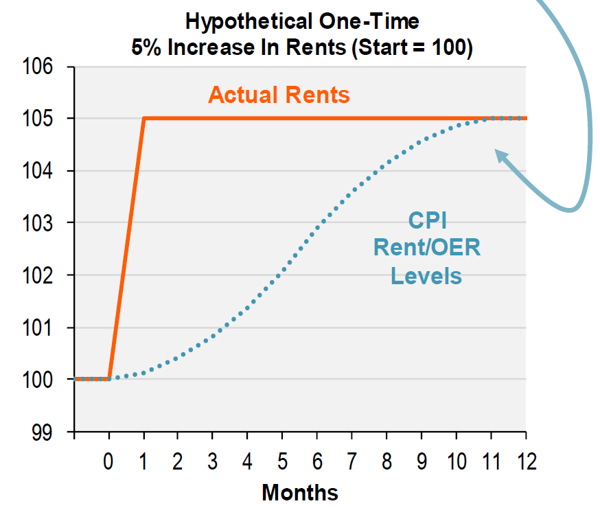
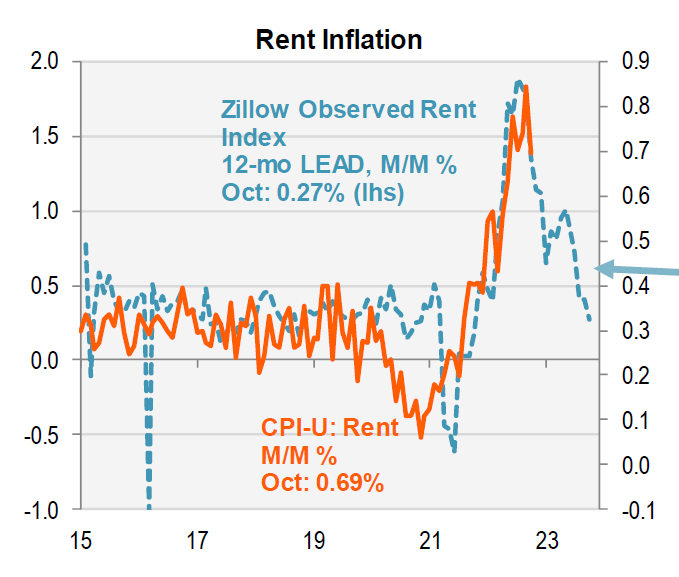
Why is CPI so ridiculously laggy? It turns out that a third of the index is comprised of shelter inflation, and the way it is calculated accounts for the lag. Piper Sandler explains: “Here’s how BLS constructs the Rent and OER CPI indexes (96% of the overall CPI shelter component): They sample 6 rotating cohorts of rental properties, twice per year - one in January & July, another in February & August, and so on. The BLE calculates the percent change in standardized rents since the current month’s cohort was last sampled (i.e. six months ago). The six-month change is then spread over the current month and the five following months (a six-month moving average). The result: A one-time change in market rents takes 11 months to fully show in CPI Rent and OER.” Charts below courtesy of Piper Sandler.
What are market rents doing? They are already decelerating and turning negative on a sequential monthly basis. A decline in CPI shelter is already baked in the cake and it is only a matter of time before it becomes a headwind for the headline number.
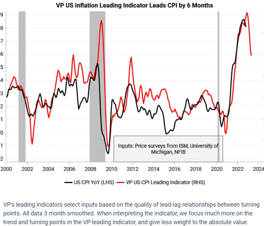
I have looked at about a dozen different models for inflation and they all point downward. I have no doubt the Fed will hike 50 bp to 4.35% in December, but what happens after that is uncertain. There are 2-4 inflation prints between now and the February and March meetings. If these prints keep coming in soft, it’s possible that December ends up being the last hike and the terminal rate tops out at 4.35% instead of market expectations of 5.05%. This would be incredibly bullish for bonds and bearish for USD.
Another model for US inflation that uses a different set of inputs, courtesy of Variant Perception
One observation from the 1970’s is that downtrends in CPI lasted approximately as long as the uptrends. The ending point differed, but time-wise they were roughly symmetrical. Based on this observation alone, this downtrend in CPI could last around 25 months, ending in July 2024.
Now onto the juicy part. I have some longer term trade ideas that are based on the thesis of inflation rolling over next year:
Short USD, long Japanese Yen FX
Usd/jpy is a turbo bet on the direction of US yields. It tends to track whichever part of the Treasury curve is leading the move, and the daily chart spits out some nice technical patterns that has made it a great trading vehicle. This year was a perfect storm for usd/jpy, as the Fed’s hiking cycle combined with the Bank of Japan’s insanely easy monetary policy resulted in a 32% move from trough to peak. I believe next year will see the start of a Fed easing cycle and the start of the BoJ’s tightening cycle, creating another perfect storm to the downside.
Japan’s core CPI climbed from 1.8% to 2.5% last month. We don’t know at what level will the BoJ decide to act, but it’s probably somewhere between 3-4%. BoJ Chairman Kuroda has pledged to maintain loose monetary policy through thick and thin by capping yields at 25 bp (an increasingly untenable strategy), but he steps down next March, and his replacement may decide to pull the ripcord on easy monetary policy.
Leading indicators for Japan inflation are still trending higher (courtesy of Variant Perception)
To put this trade on, one can simply sell usd/jpy spot in an FX brokerage account, or buy 25 delta puts expiring 6 months from now. Buying puts excites me the most because of the potential explosiveness of this trade. Imagine if the BoJ lifts the 10 yr yield cap from 25 to 100 bp after March, while the Fed ends up pivoting after December 2022. The 10 yr yield differential between USD and JPY would narrow around 140 bp within the span of 5 months, worth at least 1000 pips in usd/jpy, without the Fed even cutting rates.
5-30 year Treasury steepener
I mentioned this idea in a previous blog post: “Here’s why a 5/30 steepener makes sense - as the economy sinks into recession and the Fed realizes it has hiked too much, 5 yr yields tend to roll over and trend lower faster than 30 yr yields. As the recession accelerates, the Fed loosens monetary policy in response, trying to stave off deflation in the near term but sowing the seeds for inflation in the long term.”
Blue line = 5 yr Treasury yields. White line = 5/30 yield spread. The vertical white lines show where 5 yr yields peaked in 2007 and 2018. Also notice the 5/30 spread doesn’t spend much time below 0%
There are several reasons why I like the 5-30 yr steepener instead of an outright long in 5 yr or 2 yr Treasuries. First, the 5-30 curve historically doesn’t stay inverted (5 yr yield>30 yr yield) for long, so there is a certain degree of reliability in betting that the curve will go back to its natural state of steepness. In a recessionary scenario, 5 yr yields could track inflation lower while 30 yr yields stay elevated due to forward expectations of inflation rebounding in the next cyclical expansion. Lastly, a position betting on the shape of the curve instead of betting on the outright direction of yields tends to be more insulated from short term gyrations that may occur due to economic data releases and Fed-speak.
Long Gold
Being long gold is a bet on USD rolling over and real yields (the difference between Treasury yields and market-based estimates of inflation) topping out from positive to negative. People say gold is a hedge against inflation, but the truth is that gold is a hedge against loose monetary policy. When the Fed moves from tightening to loosening policy, that is when gold shines.
Gold also has some additional tailwinds that other currencies do not. Central banks have been accumulating gold at the fastest clip in history. This is not surprising, as the US has proven this year with Russian sanctions that a USD and fiat based reserves can be sanctioned, frozen, or confiscated.
Courtesy of Real Vision
Market sentiment and positioning are also the most bearish in three years. Courtesy of Real Vision
Central bank accumulation and market positioning is probably the reason gold has held support at 1650, despite real yields continuing to surge higher. The way I want to size the position is a 5-10% overweight allocation in an unlevered portfolio, similar to what I outlined in a previous post. An allocation to silver is an option as well, although silver is more volatile and cyclical and therefore deserves a much smaller weighting.
Long Dec 2023 Canadian Bank Acceptance futures
Bank Acceptance futures are like the Eurodollar futures of Canada. They are a bit more esoteric, as many platforms don't offer them (although Interactive Brokers does). Canada is feeling the impact of higher rates more than the US due to Canada’s lofty housing market and the fact that 40% of Canadian mortgages are variable or due to be refixed within the next 3 years.
Canadians have a higher debt to income ratio than other developed countries in the West.
Canada also has a low savings cushion relative to other countries.
Leading indicators for Canadian inflation are pointing lower, like they are for the US. (Courtesy of Variant Perception)
In addition, the Bank of Canada surprised the market last month by hiking only 25 bp instead of 50 bp. This indicates a decreasing appetite for tightening monetary policy and an increasing focus on economic weakness. Basically, if you believe the US will fall into recession and disinflation, Canada will fall harder and have to cut faster than the US.
Disclaimer:
The content of this blog is provided for informational and educational purposes only and should not be construed as professional financial advice, investment recommendations, or a solicitation to buy or sell any securities or instruments.
The author of this blog is not a registered investment advisor, financial planner, or tax professional. The information presented on this blog is based on personal research and experience, and should not be considered as personalized investment advice. Any investment or trading decisions you make based on the content of this blog are at your own risk.
Past performance is not indicative of future results. All investments carry the risk of loss, and there is no guarantee that any trade or strategy discussed in this blog will be profitable or suitable for your specific situation. The author of this blog disclaims any and all liability relating to any actions taken or not taken based on the content of this blog. The author of this blog is not responsible for any losses, damages, or liabilities that may arise from the use or misuse of the information provided.


Great article. Very insightful. Would blue chip dividend paying stocks continue to be a safe play?
'In addition, the Bank of Canada surprised the market last month by hiking only 25 bp instead of 50 bp.'
you meant they hiked 50bps, instead of 75bps